In an era where our eyes are glued to five-inch smartphone screens and professional networking happens via LinkedIn DMs, there is something remarkably defiant about a physical poster. It doesn’t disappear with a swipe. It doesn’t get buried by an algorithm. Whether it’s a bold advertisement on a brick wall, a motivational quote in a home office, or a vibrant flyer for a local gig, posters demand a different kind of attention. They occupy physical space, and in doing so, they occupy a piece of our subconscious.
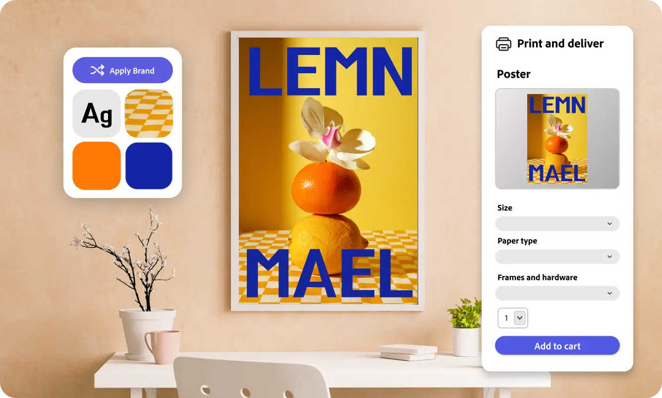
Designing these visual landmarks used to be the exclusive domain of professional graphic designers with expensive software and years of training. However, the democratization of design has changed the game entirely. If you have a vision but lack the technical background to navigate complex layers and vectors, using a high-quality Adobe Express printable poster maker can bridge the gap between a rough idea and a gallery-quality finished product. This shift means that small business owners, community organizers, and students can now produce visuals that carry the same weight and professionalism as a big-budget marketing agency.
The Psychology of Large-Format Visuals
Why do we still stop to look at posters? The answer lies in environmental psychology. A digital ad is often perceived as an interruption—a barrier between the user and the content they actually want to see. A poster, conversely, is part of the environment. It is “opt-in” viewing.
When you see a well-designed poster, your brain processes the hierarchy of information almost instantly. The “hero” image draws you in, the headline provides context, and the call to action gives you a destination. To make your poster effective, you must respect this hierarchy. If everything is bold, nothing is bold. If every font is stylized, nothing is readable.
3 Essential Tips for High-Impact Poster Design
Creating a poster is different from creating a social media post. You have to account for distance, lighting, and the “three-second rule.” Here is how to ensure your design doesn’t just look good, but actually works:
1. Embrace White Space
New designers often feel the urge to fill every square inch of the canvas with information. Resist this. White space (or negative space) acts as “breathing room” for the viewer’s eyes. it directs the gaze toward the most important elements. A cluttered poster is an ignored poster.
2. Choose Typography with Intent
Your font choice sets the emotional tone. A sleek, sans-serif font suggests modernity and minimalism, while a classic serif can evoke trust and tradition. For posters, never use more than two different font families. Use weight (bold vs. light) and size to create contrast rather than adding more fonts.
3. Optimize for the “Bleed”
When you’re moving from digital to physical, you have to think about the printing process. Always ensure your design includes a “bleed” area—an extra 1/8th inch of background color or image that extends beyond the trim line. This ensures that if the paper shifts slightly during cutting, you aren’t left with an ugly white sliver at the edge of your masterpiece.
Real-Life Applications: From Side Hustles to Home Decor
The versatility of a well-printed poster extends far beyond traditional advertising. We are seeing a massive resurgence in “tangible” media across various sectors:
- The Entrepreneur: A pop-up shop owner uses high-quality posters to turn a generic folding table into a branded experience. By consistent use of colors and logos, the physical space tells a story that a digital storefront simply can’t.
- The Educator: Teachers are moving away from generic, store-bought classroom decorations in favor of custom-made infographics that simplify complex theories, making the learning environment both aesthetic and functional.
- The Home Decorator: Personalized “event posters” for weddings, birth announcements, or travel memories have become a staple in interior design. It’s a way to turn digital memories into archival-quality art.
The Technical Side: Resolution and Paper Stock
Before you hit “print,” there are two technical hurdles that can make or break your project: DPI and Paper Stock.
DPI (Dots Per Inch): For a crisp print, your file should be at least 300 DPI at the actual size of the poster. If you try to blow up a low-resolution web image, you’ll end up with “the jaggies”—those pixelated edges that scream amateur hour.
Paper Choice: The “feel” of the paper is just as important as the design. A matte finish is excellent for posters that will be under heavy indoor lighting, as it reduces glare. A glossy finish makes colors “pop” and is perfect for high-contrast, photographic designs. For a premium, vintage feel, consider a heavy cardstock with a slight texture.
Making a Lasting Impression
In the rush to master the latest social media trends, don’t overlook the power of the tangible. A poster is a permanent representative of your brand or your message. It stays on the wall long after the “like” notifications have stopped popping up.
By focusing on clear hierarchy, intentional color palettes, and high-quality printing standards, you can create something that doesn’t just convey information, but actually moves people. Design is no longer about who has the most expensive tools; it’s about who has the clearest message and the courage to put it out into the physical world. So, take that concept you’ve been sitting on, bring it to life on the big canvas, and watch how much more impact you can have when you step outside the digital box.